Student Website Project
A fully responsive multi-page website built from scratch using HTML, CSS & Bootstrap
Project Overview
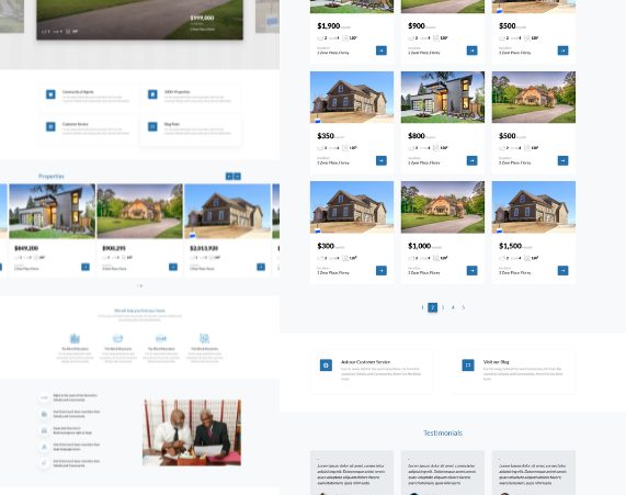
This project is a complete multi-page website built by a student as part of their coding journey. The website includes multiple sections such as Home, About, Services, and Contact, helping the student understand how real-world websites are structured and navigated.
The student also created a custom logo using Canva, giving the project a real brand identity and making it feel like a professional website.
Project Info
Student: Student Developer
Level: Beginner → Intermediate
Duration: 3 Weeks
Technologies:
HTML CSS BootstrapDesign Tool:
Canva (Logo Design)Key Features
- Responsive design (mobile & desktop)
- Multi-page navigation
- Clean and modern UI
- Custom logo designed by the student
- Contact section for interaction
Student Journey
1. Getting Started
The student began by learning basic HTML structure — understanding how to create pages, headings, sections, and links between pages.
2. Styling with CSS
After building the structure, the student added styling using CSS to improve layout, colors, and spacing.
3. Making It Responsive
The student introduced Bootstrap and learned how to use the grid system to make the website work on phones, tablets, and desktops.
4. Creating a Brand
Using Canva, the student designed a custom logo, giving the website a unique identity and making it feel like a real business project.
5. Final Build
The student combined everything — pages, styling, responsiveness, and branding — to produce a complete multi-page website.
Challenges & Solutions
One of the biggest challenges was making the layout responsive across different devices. The student solved this by learning Bootstrap’s grid system and responsive utilities, allowing the website to adjust properly on all screen sizes.
Final Outcome
By the end of this project, the student successfully built a complete website and gained confidence in real-world web development. They also developed design thinking skills by creating their own logo and structuring a full user experience.